Choosing the right colors for your living spaces can completely transform the ambiance and functionality of a room. Colors have a profound impact on our emotions and perceptions, influencing everything from our mood to the perceived size of a space. Understanding color harmony can help you create environments that are not only aesthetically pleasing but also emotionally fulfilling.
Understanding Color Harmony
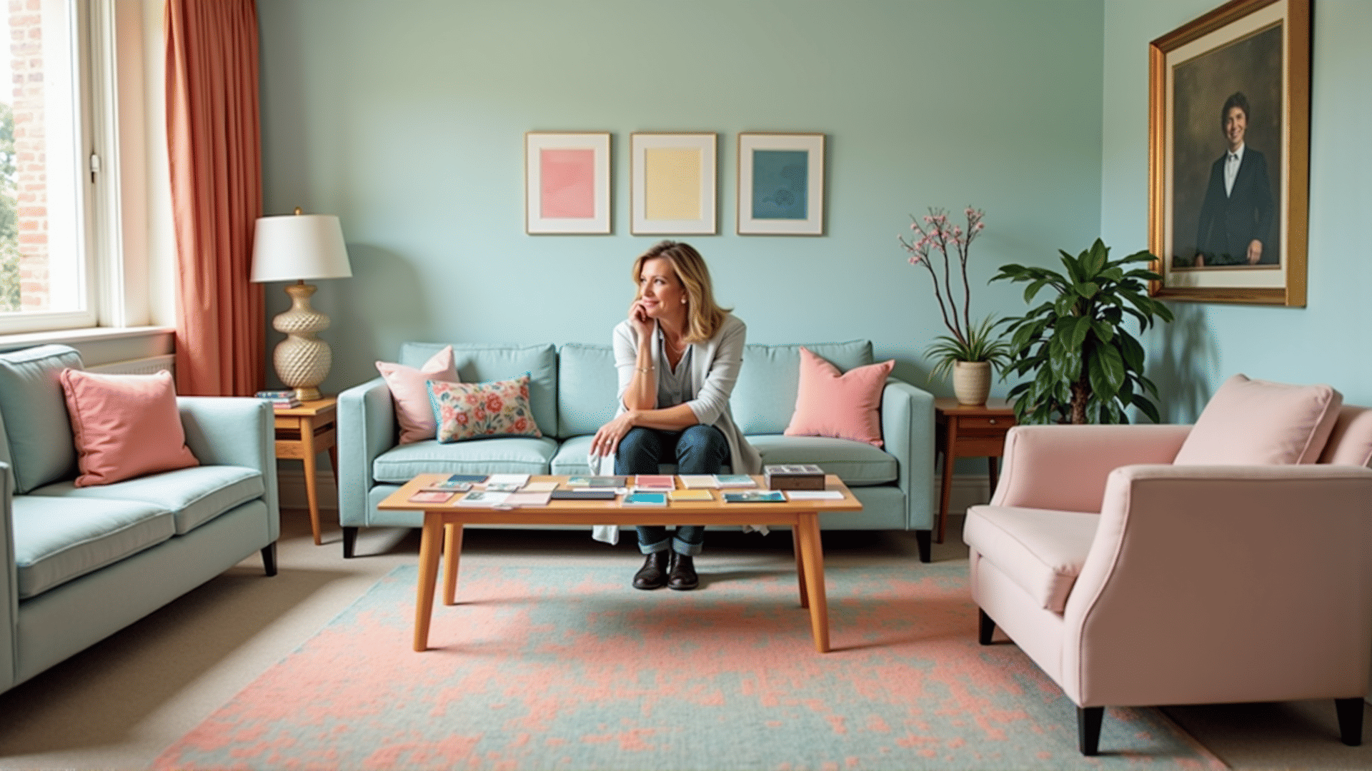
Color harmony refers to the aesthetically pleasing arrangements of colors. In interior design, it involves selecting hues that work well together to create balance and interest. Several traditional color schemes can guide you in creating harmonious designs:
-
Monochromatic: This scheme is based on variations in lightness and saturation of a single color. It creates a cohesive and soothing look, perfect for minimalist spaces. It allows details like texture and material to take center stage.
-
Analogous: These are colors that sit next to each other on the color wheel, such as blue, blue-green, and green. This scheme is versatile and creates a serene and comfortable design that is often found in nature.
-
Complementary: These are colors opposite each other on the color wheel, like blue and orange. This contrast can make a space feel dynamic. It’s a good choice if you want to highlight a specific area or element in a room.
-
Triadic: This scheme uses three colors evenly spaced on the color wheel. While vibrant and full of life, careful balancing is required to prevent the space from becoming overwhelming.
Influence of Colors
Colors have different effects on our mood:
-
Blues and Greens: These colors are calming and are known to reduce stress, making them ideal for bedrooms or areas dedicated to relaxation. Light shades can open up the space, while darker shades can make it cozy.
-
Yellows and Oranges: These are energizing and can stimulate conversation and appetite, making them perfect for kitchens and dining areas. Use them in moderation, as they can be overwhelming if too dominant.
-
Reds and Pinks: Reds add warmth and energy; however, they can be intense, so using them in accents or smaller doses might be best. Pinks lend a warm, comforting atmosphere to a space.
-
Neutrals: Shades like beige, gray, and off-white provide a versatile background that can suit any style. They can serve as a soothing foundation, allowing other colors to shine through in decorative elements.
Implementing Your Palette
Start by deciding the function of the room and the mood you wish to establish. This decision will guide your choice of color scheme. Remember that light plays a significant role; colors can look different under natural light compared to artificial light. Experiment with samples and observe how they change throughout the day.
Adding textures and patterns can also enhance your color palette. For example, a monochromatic room with varying textures can feel rich and layered instead of flat. Similarly, complementary colors in different patterns can create interesting visual contrasts.
In conclusion, mastering color harmony in your living spaces is about understanding how different hues and combinations affect our perceptions and feelings. With these insights, you can thoughtfully select colors that enhance both the aesthetics and functionality of your home, turning it into a beautiful sanctuary tailored to your personal taste and lifestyle.